April 19, 2011 new update
Note from dshort: I've updated the charts below through April 18th. Yesterday's treasury rally, as suggested by the decline in yields, was an orderly process despite the somewhat dramatic initial market response to Standard & Poor's downgrade of U.S. sovereign debt to negative from stable (read S&P's report). The most striking excerpt in the report was this observation by Standard & Poor's credit analyst Nikola G. Swann:
"Our negative outlook on our rating on the U.S. sovereign signals that we believe there is at least a one-in-three likelihood that we could lower our long-term rating on the U.S. within two years," Mr. Swann said. "The outlook reflects our view of the increased risk that the political negotiations over when and how to address both the medium- and long-term fiscal challenges will persist until at least after national elections in 2012."
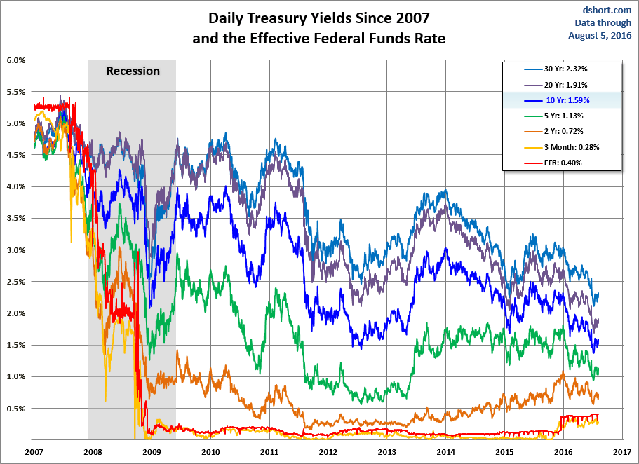
The behavior of Treasuries is an area of special interest in light of the Fed's second round of quantitative easing, which was formally announced on November 3rd. The first chart shows the percent change for a basket of eight Treasuries since November 4th.The next chart shows the daily performance of several Treasuries and the Fed Funds Rate (FFR) since 2007. The source for the yields is the Daily Treasury Yield Curve Rates from the US Department of the Treasury and the New York Fed's website for the FFR.
Here's a closer look at the past year with the 30-year fixed mortgage added to the mix (excluding points).
Here's a comparison of the yield curve at the time of the Fed's QE2 announcement and the latest curve.

The yield spread had been widening in November and much of December and since then has contracted a bit. The next chart shows the 2- and 10-year yields with the 2-10 spread highlighted in the background.
The final chart is an overlay of the CBOE Interest Rate 10-Year Treasury Note (TNX) and the S&P 500.
For a long-term view of weekly Treasury yields, also focusing on the 10-year, see my Treasury Yields in Perspective.
http://dshort.com/articles/current-treasury-yield-snapshot.html


No comments:
Post a Comment
Note: only a member of this blog may post a comment.