Source:
https://stevekirsch.substack.com/p/exclusive-what-the-medicare-data
Executive summary
If we want to settle the debate as to whether the vaccines are safe or not, the authorities should show us the data. Sadly, no one in the mainstream medical community is calling for data transparency.
In the meantime, I was able to obtain a dump of death-vax data from the Medicare database for Connecticut.
The limitations are that it’s primarily for those who died who are over 65 and the vaccination records are missing for nearly half the records. This means I don’t have a good control group making observations somewhat difficult.
Despite that, I was able to discover some valuable insights that surprised me. Here are my takeaways from looking at the data:
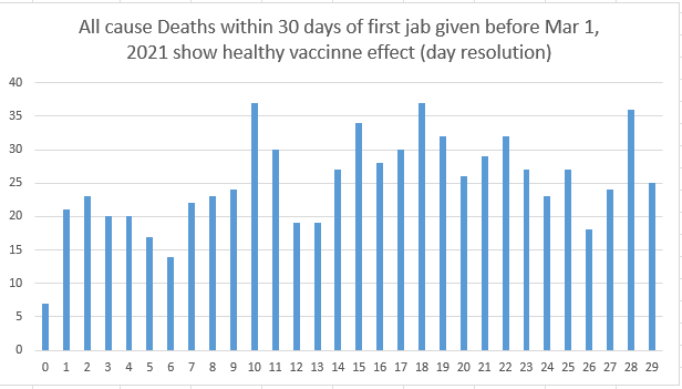
There was NO spike in deaths in the first 30 days after the vaccine was given for any age group. That was the biggest surprise to me. So the spike in deaths post-vaccine administration as reported in VAERS is simply due to the time proximity making it more likely that the event is recognized and reported. It is a reporting artifact. Note that the vaccine is killing people on Day 0, but your risk of death is relatively uniformly elevated over a long period of time.
It showed that those older than 65 have a fairly even death rate from the vaccine, and the death rate appears to increase over time (possibly due to additional doses but this was too hard to tell). The death rate seems to peak at a year after the shot, and then goes down, but is still elevated from normal. Can’t tell for how long that lasts. It could be a lifetime.
Younger people tended to die earlier after getting the shots. Your risk goes up and peaks right after 6 months from the shot, then goes back down over time to be normal (or somewhat above normal; we lack the data to tell this) after around 2 years.
Because we are looking at all-cause deaths and because the excess deaths caused by the vaccine are estimated to be on the order of 10% of the baseline deaths, it’s not easy to clearly isolate the signal from the noise. This is easier to see for younger people, but since this is a Medicare database, there aren’t a lot of younger people.
My conclusions above and below are based on this new data plus all that I know. There are other ways to interpret the same data.
Here are the relevant graphs that tell the story
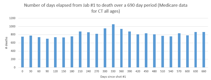
This shows that for older people primarily 65 and older, the excess deaths are spread out over time and seem to peak at about the 1 year mark.
Zooming in on the first 30 days below shows no spike in the 14 days after the shot. This means the spike in VAERS is a reporting artifact (more likely to report if temporal proximity). You can also see the healthy patient bias which drives down the deaths right after the vax (people who are about to die are seldom vaccinated).
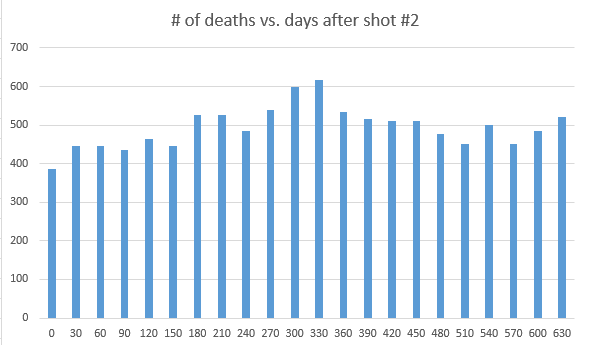
Here are the days you lived after getting shot #2 (for those who died before Jan 1, 2023). Note how it peaks around the 1 year mark, then falls. This is for all ages. So after shot #2 we see the same peak as we did after shot #1. So the vaccine is elevating your risk over a long period of time.
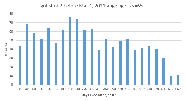
Now let’s look at ages 65 and younger only. The deaths peak at around 6 months and then fall off. They might be back to normal in 2 years, but we can’t tell from the data because we don’t have the full set of data we need to do a proper analysis.
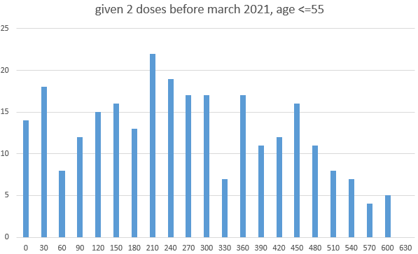
Same graph as above, but this time, the age range is limited to < 55. Since this is Medicare, we are now skating on thin ice (few records). We can see a steeper fall off and a return to a baseline after 570 days.
ACM CT data from the CDC
Here’s a link to the CDC data. Note that the 2022 data is underreported. The short story is ACM is up in 2021 and 2022.
I don’t have rights to the data so I can’t publish it
Wouldn’t it be nice if the CDC published the data we need to learn the truth?
The ratio analysis
My earlier article on ratio analysis wasn’t too useful for this data. It gave numbers like .52 for this dataset for shot #1 which you can interpret as “it saved lives in the short term” (if you believe the narrative) or that “it elevated all-cause mortality progressively over time” if you are an anti-vaxxer. I’ve updated the ratio analysis article to reflect my latest insights.
If I had younger data, a value of <.4 would have been dispositive (i.e., killed people immediately following the shot).
Summary
This is so frustrating. We are trying to draw conclusions about the COVID vaccine by looking at data snippets such as the Medicare data with half the vaccination records missing. We can learn a few things from looking at this data that we didn’t know before.
But if the authorities really want to prove the vaccines are safe, they need to expose the needed data. They haven’t done that. This is unacceptable.
Until they do, every organization should drop all COVID policies until we can see the full data. That is the responsible thing to do. Will they do that? No way.
No doctor should be recommending the COVID vaccine to patients until the data is revealed. There is no excuse for the CDC not producing this data. The fact that they haven’t should cause every doctor who still has any critical thinking skills left to push the pause button on the COVID vaccines until they do.
Unfortunately, there are too few doctors who will speak up. By and large, they all are content to follow whatever they are told to do and not ask any questions. They should be ashamed. That is not how medicine should work.
We need to set the data free.
No comments:
Post a Comment
Note: only a member of this blog may post a comment.